How cognitive shortcuts guide discovery in Youtube's search

OverviewWalkthrough
Context
search
Search
Category
search
Entertainment
Goals
arrow_upward_alt
Engagement
arrow_upward_alt
Search Success
arrow_upward_alt
Task Success
arrow_upward_alt
Retention
Biases identified
dataset
Status Quo Bias
dataset
Information Bias
touch_app
Attentional Bias
touch_app
Contrast Effect
diversity_1
Social Proof
neurology
Choice-Supportive Bias
dataset
Scarcity Principle
neurology
Salience Effect
diversity_1
Authority Bias
dataset
Default Bias
touch_app
Cognitive Load
neurology
Feedback Loop
neurology
Recency Effect

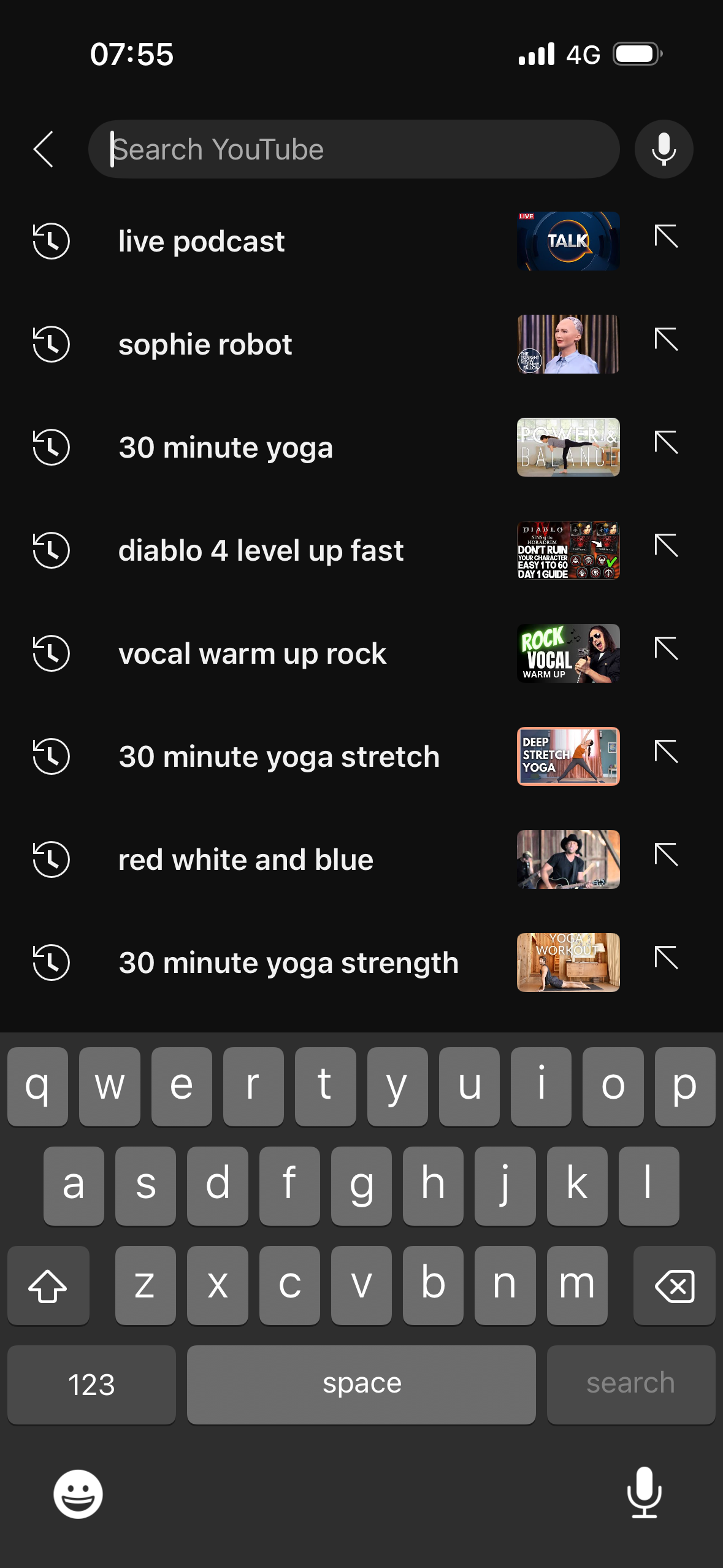
YouTube’s search experience is a carefully crafted journey powered by behavioural psychology. From the subtle prompt in the search bar to the animated feedback of voice input, each moment is designed to influence expectations, reduce friction, and build momentum.

This case study explores how cognitive shortcuts, like the ambiguity effect, social proof, and salience bias, help guide discovery. It also highlights where missed opportunities for clarity and personalisation could make the experience more transparent, ethical, and user-friendly.

The flows we reviewed

sentiment_very_satisfied

What works

  • Clear voice search CTA with live feedback loop
  • Recent search thumbnails increase recognition and engagement
  • Sponsored content strategically placed using salience and authority
  • Search filters give the illusion of control and customisation
  • Use of animated, bold, or coloured elements draws attention where needed
sentiment_sad

What doesn't work

  • Search bar placeholder text is too vague to guide intent
  • Iconography on recent search list lacks clarity of meaning
  • Filters are hidden initially, undermining perceived control
  • Sponsored results may confuse users due to subtle labelling
  • Suggested search enhancements aren’t explained, risking trust

Screen-by-screen review

youtube-search-1-1-home.PNG

Youtube home

Attentional Bias
link
Search icon blends with others, reducing salience
Goal Gradient Effect
link
Bottom nav highlights 'Home', reinforcing start point
lightbulb
Idea
Make the search icon more visually distinct (e.g. highlight it on page load) to nudge discovery behaviour and increase visibility of this core function.
youtube-search-2-1-search-landing.PNG

Search landing screen

Recency Effect
link
Recent searches shown first, aiding recall
Ambiguity Effect
link
Placeholder 'Search YouTube' lacks specificity
Attentional Bias
link
Unclear icon meanings create friction
Availability Heuristic
link
Thumbnails boost relevance of recent searches
lightbulb
Idea
Replace the vague placeholder with example queries to reduce ambiguity (e.g. 'Search yoga, travel, or creators').
youtube-search-2-2-search-voice.PNG

Voice search interface

Feedback Loop
link
Reactive animation gives real-time voice feedback
Default Bias
link
The large record button is the obvious default action, guiding users to tap without thinking.
lightbulb
Idea
Consider adding a countdown or audible cue to clarify that recording has started successfully, improving clarity for first-time users.
youtube-search-2-3-search-suggestions.PNG

Search suggestions

Default Bias
link
Suggestions build on typed text as default
Status Quo Bias
link
Users likely tap a suggestion rather than edit
Cognitive Load
link
Bolded terms reduce effort by making suggestions easier to scan and understand quickly.
lightbulb
Idea
Allow users to preview why a suggestion is being offered (e.g. 'Popular this week') to increase transparency and trust.
youtube-search-3-1-search results-list and filters.PNG

Search results (scrolled)

Social Proof
link
Views and creators imply trustworthiness
Contrast Effect
link
Visual difference between formats shapes preference
Choice-Supportive Bias
link
Users justify Shorts vs full-length results
lightbulb
Idea
Keep filter options visible while scrolling to improve control perception and reduce cognitive load.
youtube-search-3-2-search results-sponsored result.PNG

Sponsored search result

Authority Bias
link
Sponsored label and brand imply credibility
Salience Effect
link
Top position and contrast make ad more visible
Scarcity Principle
link
Ad copy suggests uniqueness or limited-time
lightbulb
Idea
Make the 'Sponsored' label more visually distinct and include a short explainer on why this result is shown first.
youtube-search-3-3-search results-menu.PNG

Search results menu

Attentional Bias
link
Dim background focuses attention on menu
Information Bias
link
Icon use implies useful differences between filters
lightbulb
Idea
Consider including brief tooltips or headers in the menu (e.g. 'Refine by...') to reinforce that this is a refinement step.
youtube-search-3-4-search results-filters.PNG

Search filters

Peak-End Rule
link
Returning to results after filters shapes recall
Status Quo Bias
link
Defaults like 'Relevance' frame best results
Information Bias
link
Multiple filter groups imply deep control
lightbulb
Idea
Surface the impact of applied filters visually (e.g. 'Showing videos sorted by view count') to affirm the user's action.

Similar case studies to explore